Since 2005 startup accelerators have provided cohorts of startups with mentoring, pitch practice and product focus. However, accelerator Demo Days are a combination of the graduation ceremony and pitch contest, with the uncomfortable feel of a swimsuit competition. Other than “I’ll know it when I see it”, there’s no formal way for an investor attending Demo Day to assess project maturity or quantify risks. Other than measuring engineering progress, there’s no standard language to communicate progress.
Corporations running internal incubators face many of the same selection issues as startup investors, plus they must grapple with the issues of integrating new ideas into existing P&L-driven functions or business units.
What’s been missing for everyone is:
a common language for investors to communicate objectives to startups
a language corporate innovation groups can use to communicate to business units and finance
data that investors, accelerators and incubators can use to inform selection
While it doesn’t eliminate great investor judgment, pattern recognition skills and mentoring, we’ve developed an Investment Readiness Level tool that fills in these missing pieces.
—-
Investment Readiness Level (IRL) for Corporations and Investors
The startups in our Lean LaunchPad classes and the NSF I-Corps incubator useLaunchPad Central to collect a continuous stream of data across all the teams. Over 10 weeks each team gets out of the building talking to 100 customers to test their hypotheses across all 9 boxes in the business model canvas.
We track each team’s progress as they test their business model hypotheses. We collect the complete narrative of what they discovered talking to customers as well as aggregate interviews, hypotheses to test, invalidated hypotheses and mentor and instructor engagements. This data gives innovation managers and investors a feel for theevidence and trajectory of the cohort as a whole and a top-level view of each teams progress. The software rolls all the data into an Investment Readiness Level score.
(Take a quick read of the post on the Investment Readiness Level – it’s short. Or watch the video here.)
The Power of the Investment Readiness Level: Different Metrics for Different Industry Segments Recently we ran a Lean LaunchPad for Life Sciences class with 26 teams of clinicians and researchers at UCSF. The teams developed businesses in 4 different areas– therapeutics, diagnostics, medical devices and digital health. To understand the power of this tool, look at how the VC overseeing each market segment modified the Investment Readiness Level so that it reflected metrics relevant to their particular industry.
Medical Devices Allan May of Life Science Angels modified the standard Investment Readiness Level to include metrics that were specific for medical device startups. These included; identification of a compelling clinical need, large enough market, intellectual property, regulatory issues, and reimbursement, and whether there was a plausible exit.
In the pictures below, note that all the thermometers are visual proxies for the more detailed evaluation criteria that lie behind them.
Therapeutics Karl Handelsman of CMEA Capital modified the standard Investment Readiness Level (IRL) for teams developing therapeutics to include identifying clinical problems, and agreeing on a timeline to pre-clinical and clinical data, cost and value of data points, what quality data to deliver to a company, and building a Key Opinion Leader (KOL) network. The heart of the therapeutics IRL also required “Proof of relevance” – was there a path to revenues fully articulated, an operational plan defined. Finally, did the team understand the key therapeutic liabilities, have data proving on-target activity and evidence of a therapeutic effect.
Digital Health For teams developing Digital Health solutions, Abhas Gupta of MDV noted that the Investment Readiness Level was closest to the standard web/mobile/cloud model with the addition of reimbursement and technical validation.
Diagnostics Todd Morrill wanted teams developing Diagnostics to have a reimbursement strategy fully documented, the necessary IP in place, regulation and technical validation (clinical trial) regime understood and described and the cost structure and financing needs well documented.
For their final presentations, each team explained how they tested and validated their business model (value proposition, customer segment, channel, customer relationships, revenue, costs, activities, resources and partners.) But they also scored themselves using the Investment Readiness Level criteria for their market. After the teams reported the results of their self-evaluation, the VC’s then told them how they actually scored. We were fascinated to see that the team scores and the VC scores were almost the same.
Lessons Learned
The Investment Readiness Level provides a “how are we doing” set of metrics
It also creates a common language and metrics that investors, corporate innovation groups and entrepreneurs can share
It’s flexible enough to be modified for industry-specific business models
It’s part of a much larger suite of tools for those who manage corporate innovation, accelerators and incubators
P.S. if you want to learn more abut the IRL and other tools, we teach a 2-day class for corporate innovation, accelerators and incubators. Info here
We know that consumer purchase decisions are often made quickly and subconsciously, but there are opportunities where it’s possible to influence a consumer’s perception of a brand. People often make buying decisions by using all five of their senses and once product designers discover what each of these sensory influencers are, they can develop packaging that strategically speaks to consumers at each stage of the decision-making process. It’s ultimately about designing a complete experience–one that supports the brand every step of the way.
At my company, we developed the 4sight Sensory Lab, pictured above, to uncover these answers. Here, for example, cold beverage drinkers known to prefer their drinks not simply cold, but chilled to the perfect temperature, are taken through a progression of exercises that mimics the various points of contact that consumers have with a product.
We identify which bottle shape, size, color, material, and texture promises that sense of cold refreshment at first glance. As the test subjects move closer, details such as condensation and frost become evident and when they are handed several bottles, each chilled to the exact same temperature–but made of different materials, textures, shapes and finishes–they provide feedback on which one feels like just the right cold.
In the Sensory Lab, our process helps us ensure that at each stage of interaction with a brand, consumers receive the right information, enabling them to see, feel, hear, smell, and taste the value of the product. Here, we’ve identified the six stages that lead to a first purchase or a repeat purchase:
This is the first impression at a distance, seeing the product in someone else’s hand, on the shelf, or across the room. It’s the first visual promise of what a product will do for your senses. For Pom 100% Pomegranate Juice, the distinctive profile of the bottle featuring those fully rounded spheres, allows the distinct dark red color of the juice to catch the attention of a shopper. It promises a bold, robust taste. A new entry into the tequila segment, SX Tequila chose a distinctive, curvaceous bottle with smooth lines and frosted texture to communicate the sense of a smooth-tasting, chilled beverage.
THE INSPECTION
Here, consumers take a closer look and this is where details begin to hint at tactile sensations. Flowing details etched into the structure of the Aquafina water bottle strongly suggest the refreshment that the product provides.
Orangina, meanwhile, promises its fresh orange flavor through a dimpled finish on the bottle that suggests you are consuming straight from an actual orange.
THE PHYSICAL INTERACTION
Next, consumers make that first physical contact and combine the visual with the tactile experience. When grasped, the gentle curvature of the Febreze bottle and the angled spray head convey the soft and pleasant aroma that will fill the air. The smooth, diagonal neck on the new Miller Lite Bottle promises a refreshing flow of beer while the bold taper from the neck to the body provides a strong and confident grip for the hand. Adding the texture of the hops etched in the glass provides further engagement.
THE OPENING
When the consumer makes a physical step towards consumption or use of the product, there’s another opportunity to solidify your brand’s perception. When the foil cover is peeled off of a can of San Pellegrino, it offers the sensation of actually peeling fruit. It also incorporates a crinkling sound, which adds to the sensory experience at opening.
CONSUMPTION OR USAGE
The point at which the product is consumed or used and here, all five senses can be at play.
A smooth metal tip on Clinique’s Even Better Eyes product provides a refreshing and reviving cold sensation on the skin. For Gerber Good Start, the designated scoop holder on the side of the container provides for a clean usage experience and preserves the product for future consumption, as fingers do not contaminate the powder.
THE COMPLETION
There’s another opportunity to create a pleasant user experience when the product is disposed of or put away for later use. Wrigley 5 Gum incorporates a lock feature and embossed details to convey a secure and clean resealable pack. The Oreo cookie package also utilizes the sense of sight with a resealable film to promise lasting freshness. Once the film is replaced after each usage, it recreates the look of a fresh, unopened package.
In The Sensory Lab, we’ve gleaned significant insight into how the five senses influence consumer decision-making at six pivotal points. Incorporating a similar approach in your design process will help insure your package effectively communicates key brand attributes at each and every point of influence.
[Image: Shopping via Shutterstock]
Here is the link to the original article: http://www.fastcodesign.com/3024657/6-tips-for-making-a-powerful-first-impression?partner=newsletter
If you were forced to rely on only two target audiences to guide all your future design work, I’d strongly recommend using astronauts and toddlers. Fortunately, the connection between them goes beyond the design of their underwear to the nature of perception and expertise, and in what we treat as valid data, and what we choose to ignore as “noise”–the extraneous details, out-of-category input, the anecdotal tidbits. As it turns out, noise is much more valuable for useful design insights than you might think.
First, the astronauts. One little-known quirk of the Apollo moon landings was the difficulty the astronauts had judging distances on the Moon. The most dramatic example of this problem occurred in 1971 during Apollo 14, when Alan Shepard and Edgar Mitchell were tasked with examining the 1,000-foot-wide Cone Crater after landing their spacecraft less than a mile away. After a long, exhausting uphill walk in their awkward space suits, they just couldn’t identify the rim of the crater. Finally, perplexed, frustrated, and with the oxygen levels in their suits running low, they were forced to turn back. Forty years later, high-resolution images from new lunar satellites showed they had indeed come close–the trail of their footprints, still perfectly preserved in the soil, stop less than 100 feet from the rim of the crater. A huge, 1,000-foot-wide crater, and they couldn’t tell they were practically right on top of it. Why?
It should have been easy for them, right? These guys were trained as Navy test pilots; landing jets on aircraft carriers requires some expertise in distance judgment. They also had detailed plans and maps for their mission and had the support of an entire team of engineers on Earth. But their expertise was actually part of the core problem. The data their minds were trying to process was too good. All of the “noise” essential to creating the patterns their minds needed to process the data accurately was missing. And patterns are the key to human perception, especially for experts.
Consider everything that was missing up there. First, there’s no air on the Moon, so there’s no atmospheric haze, either. Eyes that grew up on Earth expect more distant objects to appear lighter in color and have softer edges than closer things. Yet everything on the Moon looks tack-sharp, regardless of distance. Second, the lack of trees, telephone poles, and other familiar objects left no reference points for comparison. Third, since the Moon is much smaller than the Earth, the horizon is closer, thus ruining another reliable benchmark. Finally, the odd combination of harsh, brilliant sunshine with a pitch-black sky created cognitive dissonance, causing the brain to doubt the validity of everything it saw.
Ironically, that kind of truthful, distortion-free data is usually what experience designers want to have as input for their decision-making, no matter what they’re trying to do. We tend to believe that complex systems are the tidy, linear sum of the individual variables that create them. But despite the pristine environment of the Moon, the Apollo astronauts were repeatedly baffled when it came to simple distance and size perceptions, even after each team came back from the Moon and told the next team to be aware of it.
Meanwhile, the toddlers I mentioned earlier provide a corresponding example of the power of patterns in perception. When my first child was about 4, we came across a wonderful series of picture books called Look-Alikes, created by the late Joan Steiner. Each book has a collection of staged photographs of miniature everyday scenes like railway stations, city skylines, and amusement parks created entirely from common, found objects (see some examples here). Without any special adornment, a drink thermos masquerades as a locomotive, scissors become a ferris wheel, and even a hand grenade makes for a very convincing pot-belly stove. The entire game is to un-see the familiarity of the scene, and identify all the common objects ludicrously pretending to be something other than what they are. There’s no trick photography involved, but you can look at each picture for hours and not “see” everything that’s right there in front of you. You know it’s a trick, but you keep falling for it over and over.
The really amazing part is that the toddler, a true novice with only a few years’ experience in seeing, completely understands the scenes she’s looking at, even though every individual piece of “data” she’s looking at is a deliberate lie. Yet the pattern of data that creates the scene is “perfect.” We already know what those scenes are supposed to look like before we even see the book’s version of them, so we unconsciously project that pattern onto what we’re looking at, even to the point of constantly rejecting the contrary data our eyes are showing us. There is in fact no amusement park in the photograph I called an amusement park. But I see it anyway.
In data-processing parlance, the signal-to-noise ratio of the moonscape was perfect (actually, infinitely high), and zero for Look-Alikes pages (the whole joke is that there really was no signal there in the first place). Yet a toddler can read the noisy scene perfectly, and the seasoned test pilots were baffled by the noiseless scene. How can this be?
The lesson is that patterns drive perception more so than the integrity of the data that create the patterns. We perceive our way through life; we don’t think our way through it. Thinking is what we do after we realize that our perception has failed us somehow. But because pattern recognition is so powerfully efficient, it’s our default state. The thinking part? Not so much.
This just might be why online grocery shopping has yet to really take off. The average large U.S. supermarket offers about 50,000 SKUs, yet a weekly grocery shopper can easily get a complete trip done in about 30 minutes. We certainly don’t feel like we’re making 50,000 yes/no decisions to make that trip, but in effect we actually do. Put that same huge selection online, and all of those decisions are indeed conscious. Even though grocery shopping is a repetitive, list-based task, the in-store noise of all those products that aren’t on your list give you essential cues to finding the ones that are, and in reminding you of those that were not on your list but you still need. That’s even before you get to the detail level, where all the other sensory cues tell you which bunch of bananas is just right for you. So despite all the extra effort and hassle involved in going to the store in person, it still works better because of, not in spite of, the patterns of extraneous noise you have to process to get the job done.
To account for the role of noise within the essential skill of pattern recognition, we need to remind ourselves how complex seemingly simple tasks really are. Visually reading a scene, whether it’s a moonscape, a children’s book illustration, a grocery store, or a redesigned website, is an inherently complex task. Whenever people are faced with complexity (i.e., all day, every day), they use pattern recognition to identify, decipher, and understand what’s going on instantly, instead of examining each component individually. The catch is that all of the valuable consumer thought processes we want to address–understanding, passion, persuasion, the decision to act–are complex.
However, the research we use to help us design for these situations usually tries to dismantle this complexity. It also assumes a user who is actually paying attention, undistracted, in a clean and quiet environment (such as a market research facility), and cares deeply about the topic. Then we “clean” the data we collect, in an attempt to remove the noise. And getting rid of noise destroys the patterns that enable people to navigate those complex functions. So we wind up relying on an approach that does a poor job of modeling the system we’re trying to influence.
The challenge is to overcome the seemingly paradoxical notion that paying attention to factors completely outside our topic of interest actually improves our understanding of that topic. Doing so requires acknowledging that our target audience may not care as much about something as we do, even if that topic represents our entire livelihood. It requires a broader definition of the boundaries of what that topic is, and including the often chaotic context that surrounds it in the real world. It also requires a more than casual comfort level with ambiguity: Truly understanding complex systems involves recognizing how unpredictable, and often counterintuitive, they really are.
This is why ethnographic research is so popular with all kinds of designers. The rich context ethnographies offer is full of useful noise; the improvising people do to actually use a product, the ancillary details that surround it, and the unexpected motivations a consumer might bring to its use. These are all easier to access via a qualitative, on-location approach than they are via a set of quantitative crosstabs or sitting behind a mirror watching a focus group. It’s also a powerful human-to-human interface, in which the designer uses his innate pattern-recognition capability to analyze patterns in user behavior.
What often gets overlooked is the role noise can and should play in quantitative research. Most designers’ avoid quantitative research because of the clinically dry nature of the charts it produces, and the often false sense of authority that statistically projectable data can wield. However, only quantitative research can reveal the kind of perceptual patterns that are invisible to qualitative methods, and the results needn’t be dry at all. The solution is to appropriately introduce the right kind of noise to quantitative research, to deliberately drop in the necessary telephone poles, trees, and haze that allows those higher-level perceptual patterns to be seen and interpreted.
How audio dithering works.
Fortunately, there’s already a model for this. When analog music is digitally recorded, some of the higher highs and lower lows are lost in the conversion. Through a process called dithering, audio engineers can add randomized audio noise to the digital signal. Strangely enough, even though the added noise has nothing to do with the original music, adding it actually improves the perceived quality of the digital audio file. The noise fills in the gaps left by the analog-to-digital conversion, essentially tricking your ear into hearing a more natural-sounding sound. The dithered audio really isn’t more accurate, it just sounds better, which is more important than accuracy. Returning to our opening examples, the moonscape was in dire need of dithering, while the Look-Alikes scenes were already heavily dithered. And the real world in general is heavily dithered.
So, for quantitative research aimed at guiding the design process, the trick is to value meaning above accuracy. Meaning can be gleaned via the noise you can add to the quantitative research process by including metrics outside the direct realm of your topic area. It means considering what else is adjacent to that topic area, acknowledging the importance of respondent indifference as well as their preferences, and recognizing what kind of potentially irrational motivations are behind the respondents’ approach to the topic, or the research itself.
At Method, we’ve developed a technique for observing these perceptual patterns in quantitative data by using perceptions of brands far afield of the category we’re designing for. Essentially, it’s a dithering technique for brand perceptions. This technique often displays an uncanny knack for generating those hiding-in-plain-sight aha moments that drive really useful insights. There are doubtless many other approaches you can employ once you make the leap that acknowledges the usefulness of noise in your analysis.
But no matter what format of research you use in your design development process (including no formal research at all), there are some guidelines you can follow to allow the right amount of useful noise to seep into your field of view, so that your final product does not wind up being missed on the moonscape of the marketplace:
• A LITTLE HUMILITY WORKS WONDERS.
Recognizing that you’re not the center of your target audience’s universe allows you to understand how you fit in. Be sure to take honest stock of just where your target audience places your topic area on their list of priorities.
• STEP BACK FAR ENOUGH TO ALLOW PATTERNS TO EMERGE.
No matter what metrics you’re using, consider looking several levels above them–or next to them–to identify patterns that are impossible to see when you’re too close to the subject.
• GAUGE THE LEVEL OF EXPERTISE OF YOUR TARGET AUDIENCE.
How familiar is your target audience with your subject? Are they experts or novices, and how are you defining that? Generally, the higher the level of expertise, the higher the dependence on pattern recognition. Novices carefully and slowly compare details; experts read patterns quickly and act decisively.
• CHECK THE DATA DUMPSTER BEFORE EMPTYING.
No matter where your data comes from, think about what has been omitted. Was that distracting noise that was tossed, or crucial context?
By taking a look at the entire picture–instead of isolating a single data point–you open up opportunities for understanding the motivations, reasons, and outlying factors that impact data. Contrary to popular practice of stripping out noise, noise is in fact critical to the generation of deep insights that allow us to design better and more effective brands, products, and services.
The burgeoning Latin American digital media market represents an amazing opportunity for content creators. Representing more than 7% of global Internet users, Latin America is home to emerging markets, Brazil and Argentina, where 79% and 28% of the population consumes content on the Web, respectively — a combined population of more than 100 million. If you add Mexico to the list, where 30% of the country’s 112 million people use the Internet, the list grows to 130 million Internet users.
In Latin America, Facebook accounted for 25% of all time spent online and social networking in general accounted for nearly 30% of online minutes at the end of the year, an increase of 9.5% over the past year. In addition to social media usage, online video consumption increased more than 10% across Brazil, Mexico, Argentina and Chile, and online retail visits increased 30%. The number of searches in 2011 increased 38% to more than 21 billion and, with an average of 173 searches per searcher, Latin America leads the globe in search frequency.
The U.S. Hispanic market represents an equally important demographic. More than 33 million Hispanics were online in September of last year, representing 15% of the U.S. online market, a demographic that is growing three times faster than the general market online. Eighty percent of online Hispanics use a search engine each month and 80% of online Hispanics visit Facebook each month.
Content creators must focus on the Latin American and U.S. Hispanic markets in order to maximize overall content viewership and engagement. Reaching English-speaking content consumers in the U.S. and south of the border has never been more important and will only become more important in the coming years. Moreover, creating and distributing Spanish-language content in the U.S. and Latin America is an equally important objective.
Understanding and working within these communities will enable brands and publishers to attract a portion of the world that will dominate digital content consumption in the coming years. The creation of relevant content and finding partners to help distribute that content must be among your top priorities.
With all of this in mind, Outbrain is honored to have been named the Top Digital Media Innovator in the Latin World at the 2012 Latin American Advertising and Media Awards at the Portada Hispanic Media Conference. The award honors companies in Latin America, the United States Hispanic market and Spain for excellence in media and digital advertising. We are particularly humbled to have been nominated alongside the following innovators:
Hunt Mobile Ads
Impaktu
Jumba Mobile Network
Kontextua
Matomy México
Netbangers
Premier Retail Networks México
Terra Live Music
Vostu
“So much of the Portada Conference focused on the power of storytelling and producing great content,” said Erik Cima, VP of Hispanic Markets at Outbrain. “Winning this award is satisfying because we’re playing a part in helping the Hispanic and Latin American markets surface and distribute that great content.”
Por: Federico Hernández Ruiz* Consultor, socio fundador en asimetagraf.
En nuestro entorno y quehacer como empresarios hay una constante que aparece una y otra vez, esta constante es como debe ser la propuesta. Nos referimos a la propuesta de servicio o a la propuesta de producto.
Muchos de nosotros como empresarios definimos un producto o servicio y creemos que lo que sigue es comercializarlo para lo cual están las áreas de mercadotecnia y ventas.
La verdad es que todos comenzamos haciendo una propuesta con lo que tenemos o lo que creemos que debe de ser, esto no es un mal inicio. Es más, es el mejor inicio que hay, solo que este debe estar enriquecido por un halo de duda. A lo que me refiero es, lo que hemos mandado al mercado es una propuesta y como tal puede ser bien solamente recibida, bien recibida o incluso puede ser rechazada. Si concebimos que lo que hicimos fue una propuesta y que estamos reconociendo lo que la gente o el mercado quiere, entonces podremos mejorar o cambiar nuestra propuesta. Y es justo ahí donde muchos nos atoramos. Creemos que lo que proponemos es lo adecuado y que solo debe ser mercadeado o vendido adecuadamente, pero eso no es del todo cierto.
Efectivamente, mercadotecnia nos ayudará muchísimo. Sus técnicas y procesos facilitarán la manera en que nos comunicamos con la gente pero siempre necesitará contar con la clara identidad de la empresa. Si esta identidad tiene oportunidades no atendidas, mercadotecnia y ventas se verán limitadas en sus capacidades para entregar un mensaje claro, contundente y con la fuerza necesaria no solo para entregar, sino para que la gente lo pida.
Les comparto, hacer una propuesta necesita incluir una palabra: “Valor”. Necesitamos hacer una propuesta de valor. En la cual está implícito un beneficio para la persona o entidad que va a usar o consumir el producto o servicio. Así es, nuestra propuesta debe beneficiar a alguien y por supuesto a nosotros también.
En este diálogo que existe entre lo que ofrecemos y entregamos, con quien recibe y usa, es donde muchos perdemos camino o dejamos de ver con claridad hacia dónde vamos. Creemos que si cambiamos nuestra propuesta, dejaremos de beneficiarnos, dejaremos de ser quiénes somos, perderemos nuestra identidad, la razón de ser. Yo les comparto que esto no es así.
La razón es que antes que nada, nuestras empresas y nosotros somos entes sociales y funcionamos en sistemas de convivencia. Nuestro intercambio es eso, un sistema en el que participan diferentes actores o elementos y todos construyen una experiencia que sucede.
Todos vivimos la empresa y sus productos. Al manejar un carro, no solo consideramos la marca, sentimos los asientos, olemos el interior del carro, escuchamos el motor, vemos los accesorios y tocamos las vestiduras, los asientos y el volante; al manejar, escuchamos el sonido de todo el carro en tránsito. En fin, es un sistema que vivimos con la marca y el modelo, sabemos que la identidad y su propuesta es la que nos gusta.
Es por está razón que nuestra propuesta y nuestra identidad están estrechamente relacionadas, necesitan reconocerse en un sistema en el que ante todo hay intercambios. Intercambios de productos y servicios por dinero, pero también hay emociones, relaciones, vivencias, espacios… Es un conjunto de elementos que debe tomarse en cuenta para reconocer con mayor claridad: quiénes somos, cómo participamos, cómo somos percibidos y lo mejor, cómo nos concebimos.
Es un sistema que está vivo y que puede moldearse o cambiarse en el momento que sea necesario.
Esta dinámica de vivencias le sucede tanto a la gran empresa como al micro empresario. Todos participamos y contribuimos en estos sistemas. Todos podemos cambiar y transformarnos para tener una mejor relación con nuestro entorno, para ser más competentes, si así lo queremos ver.
Podemos ser y tener la identidad que decidamos, para hacer la mejor propuesta al mercado. Una propuesta de valor que nos beneficia a todos.
Si reflexionamos sobre nuestra identidad como empresa y recordamos que la identidad se vive y sucede, entonces podemos relacionarla con el cómo queremos que esto suceda. Yo tomo como principio las características que definen ser competente y éstas son:
Parecer ser, ser y actitud
Todos conocemos empresas que podríamos colocar en esta definición. Es más, por ella tomamos muchas decisiones para relacionarnos con ella. Nuestras decisiones van desde el coche que usamos, el lugar en el que vivimos, el grupo con el que convivimos, etc. Como personas nos sucede exactamente igual. Convivimos en el sistema y llegamos a acuerdos o principios que nos guían para actuar.
La identidad de una empresa está estrechamente relacionada con su propuesta y es por ésta que podemos ver con claridad si nos propone un beneficio.
A todos nos ha pasado que hemos sentido desconfianza sobre un artículo, un servicio o una persona. Hay algo que no nos gusta. La respuesta está en cómo nos sucede ese contacto, cómo identificamos si nos conviene o no. La razón atrás es que el sistema está actuando y el conjunto de elementos que están participando no entregan un mensaje coherente y congruente. Sencillamente hay algo fuera de lugar. Y no digo que algo esté mal, digo que hay algo fuera de lugar, algo que desentona y que muy posiblemente necesite ajustarse.
Parecer ser, ser y actitud no son características que se dan por creación espontánea, son expresiones de la empresa. La empresa, sus empresarios y colaboradores construyen de manera cotidiana esta identidad.
La identidad por eso no se puede inventar o colocarse, la identidad es una expresión única de cada empresa. Como dice el dicho: “La mona aunque se vista de seda, mona se queda”, y la empresa no es ajena a este dicho.
Un buen ejemplo del manejo común de la identidad es la de crear un logotipo. Un logotipo puede servir para identificar a la empresa, para que la ubiquen solamente. Pero no llegará a ser una identidad hasta que contenga y represente a ese sistema dinámico que es la empresa. Un logotipo se transformará en identidad hecha marca al contener esa expresión cultural de empresa.
Una identidad puede tener diferentes propuestas, entendiendo propuesta de servicio o producto durante el tiempo. Además es la manera en que interactúa con su entorno. Una identidad es un proceso que nunca termina, que trasciende en el tiempo y contribuye a la construcción de una cultura.
Una identidad implica poder ofrecer un servicio desde el interior de su razón de ser.
Por quien somos, proponemos y resolvemos para tu beneficio, para el beneficio de todos.
Tener una identidad con una propuesta clara parece sencillo y sí lo es. Lo único que se requiere es disposición para reconocer que participamos en un sistema. En el cual tenemos características únicas por las que hacemos y ofrecemos un producto o servicio. Lo hacemos con una propuesta que corresponde a nosotros, gracias al proceso de reflexión constante, continuo y estructurado que hacemos. Tener identidad y una propuesta significa que hemos diseñado quiénes somos y cómo nos relacionamos.
El secreto está en el diseño.
La palabra clave es: “Diseñamos”. Diseñar no es otra cosa que recrear un proceso de reflexión que nos permite cuestionarnos el por qué hacemos lo que hacemos, cómo lo hacemos, para quién lo hacemos, qué esperamos y qué esperan de nuestro producto o servicio. Diseñar no es embellecer, no es acomodar para que se vea bien. Diseñar implica observar, reconocer, crear ideas, hipótesis, probar y experimentar.
Diseñar nos invita a instalar un proceso continuo de reflexión, capaz de alimentar a la empresa y expresarse en todas las áreas, incluyendo la manera en que se entregan o se brindan servicios. Identidad y propuesta requieren ser definidos por diseñadores. Si eres empresario, este es el momento de comenzar a diseñar tu empresa, sus productos y servicios. Con ello podrás contar con una de los capitales más grandes que una empresa puede tener: el ser querida, deseada o admirada. Podrás lograr con tu empresa ser la razón por la que muchas personas conducen sus vidas, ser un contribuyente de valores y riqueza en la sociedad. Con tu aportación, la sociedad entera te retribuirá con lealtad y con sentido de pertenencia. La gente adentro y afuera de la empresa se sentirá orgullosa de pertenecer a ella, a tu empresa.
Ahora sí, si en tus planes está darle identidad a tu empresa y crear una propuesta, acompáñate de los diseñadores adecuados como lo son los consultores de la comisión de Consultores de Coparmex en Querétaro. Más de uno podrá acompañarte, pero sobre todo, podrás liberarte de los mitos que te detienen.
Si decides contratar a un diseñador para crear una imagen que te identifique, cuida que no sea solo un embellecedor o creador de disfraces. Con él o sin él, saldrá a relucir la verdadera identidad de quién eres y cómo es tu empresa.
* D.G. Federico Hernández Ruiz
Socio fundador y Consultor en Identidad estratégica en asimetagraf y representante para la CGTFL en México de Duraznos, Nectarinas y Ciruelas California
Como consultor se destaca en la creación de sistemas de identidad especializado en productos de consumos. Su trayectoria cuenta con más de 20 años de experiencia y ha colabora desde grandes transnacionales hasta pequeñas y micro empresas. Algunas de éstas son: Kellogg’s, Heinz, La Perla, Grupo Pando, entre otros.
Actualmente representa a la California Grape and Tree Fruit League “CGTFL” para la promoción de duraznos, nectarinas y ciruelas California en México. https://www.facebook.com/CaliforniaDNC
The conversations salespeople have with prospective customers involve these visual, auditory, and kinesthetic channels. Can different amounts of visual, auditory and kinesthetic information influence the price customers will pay for an item? Recently, a sales linguistics experiment was conducted in order to answer this question. Sales Linguistics is the study of how customers and salespeople use language during the complex decision-making process.
Sensory Information Price Test
Study participants were separated into three groups and six items were presented to them in a classroom setting. All participants were business professionals and university graduates between the age of twenty-four and fifty-seven. The groups were asked to estimate the price of each item and rank whether they had a low, medium, or high level of comfort with the answer they gave.
The first group would be presented only visual information consisting of a picture of the item and a brief description. The second group would be shown the same visual information as the first group, but the description would be read to them with dramatic emphasis and accentuation, creating an auditory connection. The third group would be shown the visual information, read the description in the same manner as for group two, and also be provided the opportunity to hold and inspect the item before making their guess, creating a kinetic bond..
The participants were presented with an eclectic mix of items. In order, they were shown a baseball hit by famous home run hitter Manny Ramirez of the Cleveland Indians, a six inch wooden penguin honoring Admiral Byrd’s expedition to the south pole, a black plastic stapler, a copy of Rudyard Kipling’s second Jungle Book published in 1915, a vintage brass letter opener from Italy, and a 1886 Morgan United States Silver Dollar.
Understanding the Test Results
While the test results provide many different revelations about how people interpret information, two high-level metrics underscore the impact sight, sound, and touch can have when making a decision about price. Below are the average answer comfort scores for each group (with three being the highest score). You’ll notice the scores increase with the addition of more sensory information by approximately 20 percent. The third group who received the highest amount of information from all three sensory channels had the highest sense of comfort with their answers.
The next point of comparison is average total overall price, which is calculated by adding the estimated price together for each of the six items. The average total overall price for each group varied greatly with group two (visual and auditory information) being the highest at $325,000. In addition, 29% of group two members estimated all the items cost over $250,000 whereas none did in group three.
Clearly, the test results show that different amounts of visual, auditory and kinesthetic information influence the perception of the item’s price. The experiment also provides other important lessons for sales and marketing professionals.
Customer Miscommunication
The mind does not treat all information equally. Information is ignored, misinterpreted, and generalized based upon surrounding experiences. For example, study participants misinterpreted that the baseball hit by Manny Ramirez was a home run ball when it was only a foul ball. You should never assume prospective customers have received the message correctly.
Verbal Suggestion Susceptibility
The mind is quite susceptible to verbal suggestions. Group two’s average total price was nearly seven times that of group one and close to twenty times the average of group three. The tone, tempo and demeanor of what you say can have more impact on a prospective customer than the actual words you speak. This is a particularly important point for salespeople who sell primarily over the phone.
E-mail Communication Dependency
Salespeople have increasingly grown to rely on e-mail for their primary method of communication with prospective and existing customers. There is a down side to this dependence since the persuasiveness of verbal suggestions is forfeited. Check your sent box and examine the last twenty e-mails you sent. Where would a phone call or in-person conversation have been better suited?
Avoid Product Evaluations
No salesperson typically wants to slow down the sales cycle by having the customer conduct a lengthy product evaluation. This study provides an entirely new reason why they should be avoided. The results suggest that hands-on familiarity with an item actually lowers the perception of its value. For example, the average price for group three who handled the brass letter opener was $100 while group two’s average was nearly $10,000.
Sales Presentation “Talk Track”
The “talk track” that accompanies sales presentations and product demonstrations plays a critical role in shaping the prospective customer’s perception of value. In this regard, many companies don’t take the time to ensure the fluency of their sales organizations by providing them compelling written scripts and testing them to ensure they are able to delivered persuasively.
it was Rudyard Kipling who said “Words are, of course, the most powerful drug used by mankind.” He was right. Your most important competitive weapon is your mouth and the words you speak. This test proves it’s not only what you say, but also how you say it!
There’s an exciting new area of study called “sales linguistics” that provides key strategies on how to structure language-based interactions that turn skeptics into believers. The goal of sales linguistics is to understand how salespeople and their prospective customers use and interpret language during the meetings and presentations.
From a sales linguistic perspective, every interaction has three stages, and each stage requires different linguistic strategies. The opening stage comprises the few minutes at the beginning of the talk, the main stage is the longest period of interaction where the main messages are delivered, and the closing stage is the time at the end of the speech. For example, if you were making a 30 minute presentation, the opening stage would be about seven minutes, the main stage would be seventeen minutes, and the closing stage six minutes.
Your personal demeanor should vary at each stage, moving from approachability (not overfriendliness or too formal) in the opening to confidence when talking in the main stage. At the close, you want to establish “situational dominance.” Most people mistakenly equate this term negatively to the use of brute force to overwhelm someone. Conversely, situational dominance is when the listener chooses to accept and internalize your words so they follow your advice.
The goal of the first stage is to establish a behavior interruption. Put yourself in the position of the listener for a moment. You’ve sat through thousands of different presentations, and you probably have a lot of other things on your mind. Therefore, the first step should be to perform a behavior interruption to break the listener’s mode of thinking and stand out from previous memories.
The behavior interruption starts the process of building rapport, engages interest, and provokes open-mindedness. It successfully sets the stage for the remainder of the speech. But what exactly is a behavior interruption? Let me explain with the following analogy. An Apple iPod can store thousands of songs. We have several iPods in my household, and I frequently listen to my daughter’s to check out the latest hits. As I thumb through her playlists, each song has just a few seconds to capture my attention. If the introduction isn’t interesting, different, or exciting, I immediately move on to the next song.
Do not equate a behavior interruption to simply telling a joke or funny story at the beginning of your presentation. A behavior interruption is pre-meditated language structure. For example, I worked at a company whose core technology was originally developed by the California Institute of Technology and funded by a grant from NASA. Explaining the origins of the company during presentations — not with one simple slide with a few bullet points, but using highlights of the project and its successful results set against the black backdrop of the space shuttle in outer space — was a great behavior interruption.
You should consider this fact when structuring the main section of your presentation. The average person will hear only seven and a half minutes of a one-hour presentation and remember only half of the words he or she hears. In essence, we don’t listen and our conscious mind rejects far more words than we actually hear. However, the subconscious mind acts as a reservoir for this overflow of information.
One sales linguistic persuasion technique that can be used to present information is the metaphor. Metaphors are stories, parables, and analogies that communicate ideas by using examples that people can relate to and identify with. Metaphors enable complex concepts and theories to be explained in an understandable, interesting, and persuasive manner. Using metaphors is a nonthreatening way to present your point of view, facts, and directions you would like your audience to follow.
The power of metaphors lies in their individual interpretation. While the conscious mind is listening to the content of the surface-level story, the subconscious mind is deciphering its own message. For example, every cigarette package contains a factual warning from the surgeon general that smoking causes cancer. However, I highly doubt these warnings are actually preventing people from smoking. Rather, I believe the personal stories you see on television told by previous smokers about their tremendous health problems are far more influential.
The language structures to be employed during the closing section should include commands and presenting foreground and background suggestions. A command is an instructional statement that creates a binary type of yes or no response from the recipient. It is typically associated with a hard close and “take it or leave it” mentality. Foreground suggestions (medium close) are explicit, but they deflect the source of the request from the demander. Background suggestions (soft close) lead recipients to believe they are acting of their free will when in fact they have been directed to follow a message.
Let’s pretend I am a passenger in your car and I feel you are driving too fast. A command would be “Slow down!” A foreground suggestion would be “You know the speed limit is 45 mph and police ticket a lot of speeders here.” A background suggestion would be “A speeder was in a horrible accident last week in this exact spot.” While the background suggestion may be more subtle in its delivery, it can trigger a more profound reaction.
Every presentation is based upon the complex process of communication consisting of verbal and nonverbal messages that the listener receives consciously and subconsciously. However, since we are talking all the time we tend to take the process for granted. Persuasion is not about getting others to acknowledge your arguments; it’s about making them internalize your message because they believe that it is in their best interests. Ultimately, persuasion is the ability to tap into someone’s emotions and reach the deeper subconscious decision maker within that person.
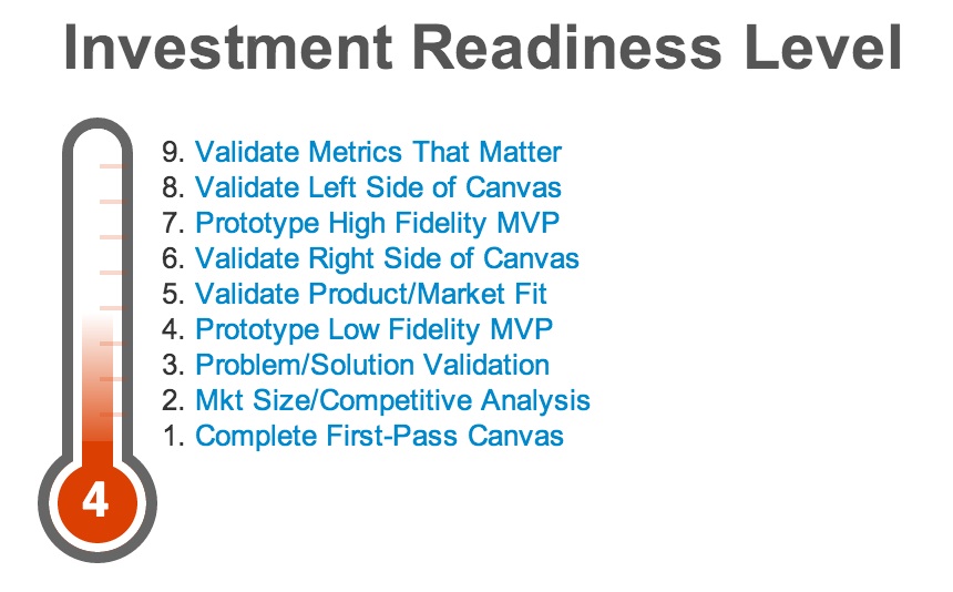


 Image: Flickr user


 JUAN
JUAN


